Pareto Plot is also called Pareto chart, 8020 chart and so on. It is a chart that uses quality improvement projects from the most important to the most important order. It is formally composed of two charts, one is a histogram that marks the frequency of occurrence of each item, and the other is a histogram. Is a line chart that marks the cumulative percentage of items. The main uses of the map are: showing the extent to which each quality improvement project affects the overall quality problem in an important order; identifying opportunities for quality improvement.

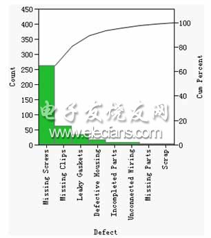
Figure 1 Routine Arrangement Figure 1 shows a company that produces electronic products that counts and records the defect records that have occurred in recent production. Obviously, the frequency of "Missing Screws" is significantly higher than other defects such as "Missing Clips" and "Leaky Gaskets". This opportunity should be seized as the main direction of quality improvement. It is worthy of in-depth investigation and research. analysis.
It should be noted that when applying the permutation chart, the main purpose of drawing the permutation chart is to eliminate the secondary "majority" and find the key "minority". Therefore, when you find that the histogram has a slow downward trend and there is not much difference between the head item and the tail item, you can try to adjust it by:
1. The ordinate of the histogram is not represented by the “number of pieces†but is represented by other quantifiable indicators (such as “amountâ€).
2. The abscissa is not represented by "defects", but is instead represented by other classification indicators (such as "product type").
3. Add layered variables (such as "time", etc.) and draw a "stratified arrangement" of the StraTIfied Pareto Plot.
The purpose of all these methods is to find major contradictions in disorganized data more quickly and accurately.
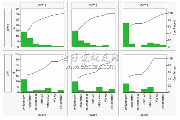
JMP software understands the importance of these details in real-world work, so the options are available on its Pareto diagram platform. For example, if we record the date (OCT1, OCT2, or OCT3) and the device cleaning status (before or after) when recording defects, we can refine the overall arrangement of the map to 6 (= 3 * 2) sheets or even More, a hierarchical arrangement of information on two dimension categories (Figure 2). This makes it possible to more clearly observe the distribution of defects under different date and different equipment cleaning conditions, so that we can find the key problems, and also can be used to compare product quality under different conditions.

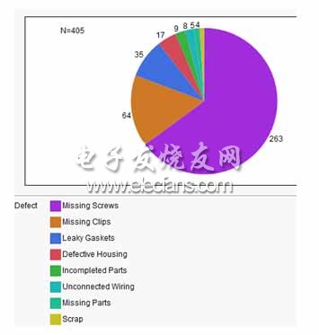
Figure 2: Hierarchical arrangement diagram In addition, there is a small trick: Considering that some domestic enterprises are accustomed to using simple graphic analysis such as pie charts to analyze such quality problems, JMP software's “Pareto Diagram†platform provides “arrangement diagrams†and “ A quick transition between pie charts. Figure 3 is a pie chart that displays the defect categories and can be used to perform a simple analysis of the Pareto phenomenon.

Figure 3 is an arrangement diagram converted into a pie chart
European Socket Connector,Straight Needle European Socket Connector,Waterproof European Socket Connector,Vertical Straight European Socket Connector
Shenzhen Jinyicheng Electronci Technology Co.,Ltd. , https://www.jycconnector.com